Art Reboot!
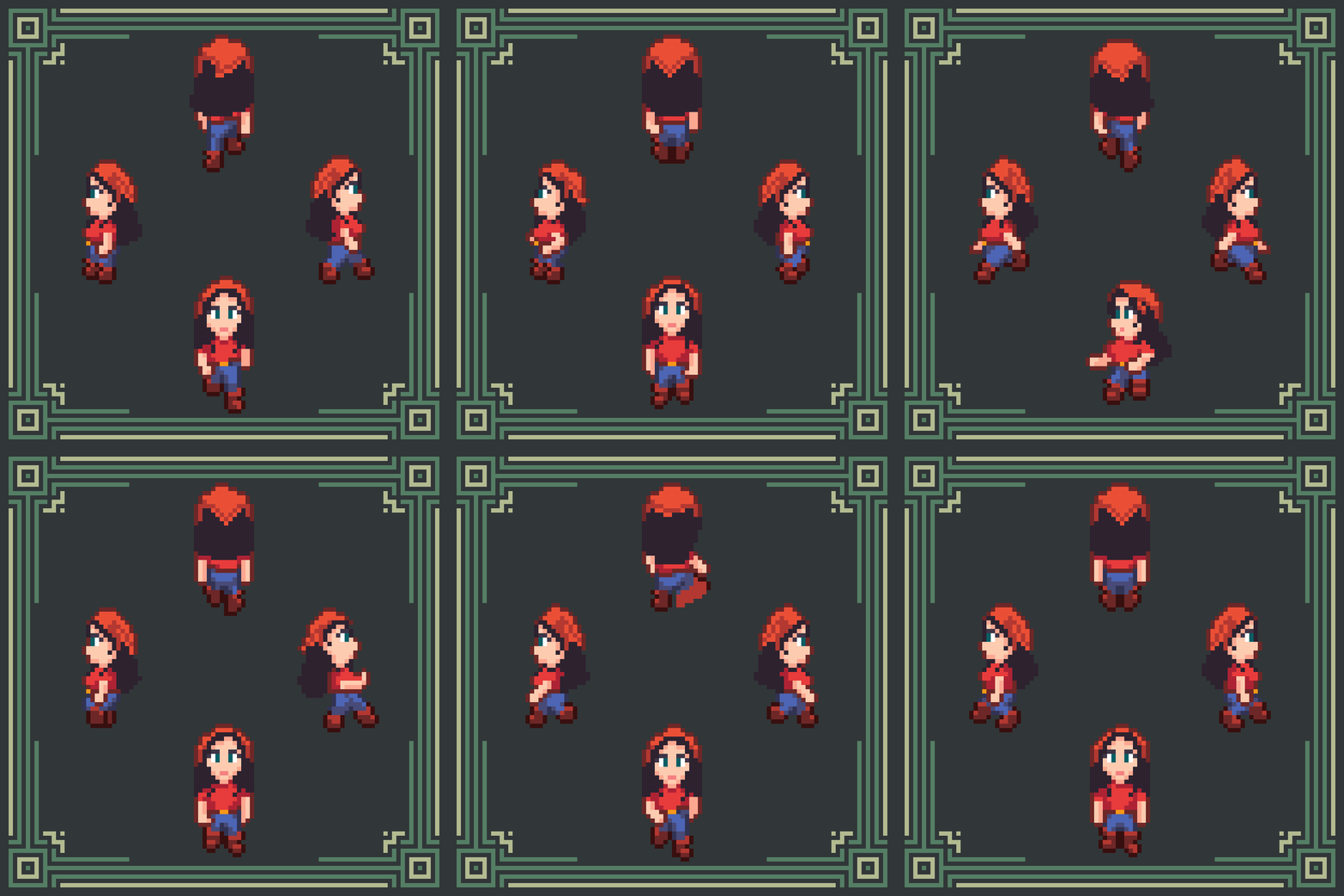
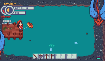
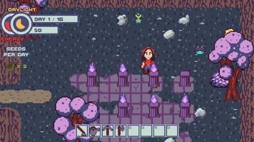
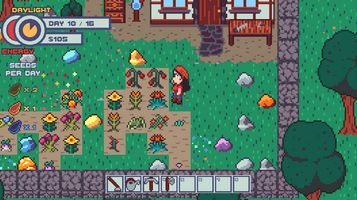
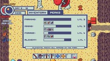
The original Moondrop Mountain was a Seven Day Roguelike Challenge, which places certain constraints on your project. Chief among those are the need for speed. That applies to things like the scope of the game design (rapid iteration, scope creep is death) to the graphics (the art must be simple - no time to get bogged down in detailed work.) The original art style was born of that time constraint. I've been working on the game for nine months and counting, and I plan to eventually release the game commercially. It's time to upgrade the art direction.
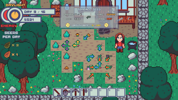
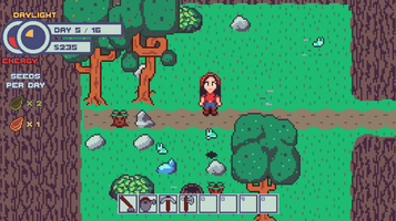
This update rehauls the whole art style of the game in two major ways. First, the main character Jay is much much muuuch more detailed. She went from a 16x16 sprite with a single direction and 3 animation frames to a 32x16 sprite with 3 directions (north, south, and east - west is just east flipped) with 60 frames of animation. Once Jay was twice the size, the rest of the art needed to be rescaled to balance things out. Some things were kept the same size - rocks are no longer the same size as a person - while others were bumped up in height, like trees and the workbench. That last one didn't make sense when it came up to Jay's knees.
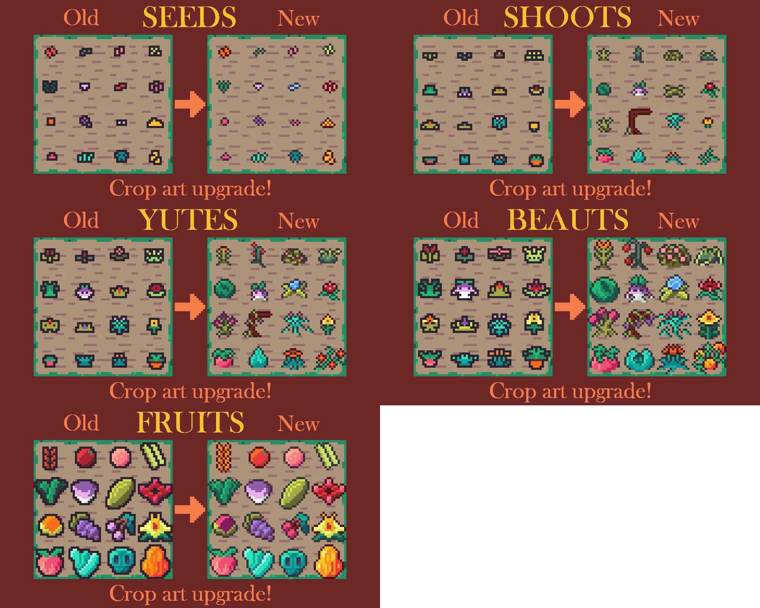
The second major art change is to make the sprites in general more detailed. The early sprites especially (like the crops) were smaller and had a more flat shading. This worked when Jay was a tiny sprite but not so much when she was larger. All the crops got a redo from their automatically-generated tiny sprites to more detailed versions.
One little change that made a big difference was moving from a uniform black square outline around every sprite to a hue-appropriate dark-color circle outline. (To picture the difference, imagine a pixel with an outline consisting of the pixels north, south, east, and west. That's a circle outline. Now imagine a pixel with an outline that also include the northeast, northwest, etc. That's a square outline.) The square outline tended to obscure smaller details inside a huge blob of dark color. It's something I had to keep in mind while drawing. If I wanted a detail to be readable, it had to be a certain distance away from nearby edges or it got lost in the morass of outline. A circle outline doesn't solve that issue completely, but it does give you a lot more room to maneuver.
I'm very happy with were the game seems to be headed! The art overhaul definitely gives the game a more polished feel, and it gives me a good idea where to go in the future. Next up: finishing off the Re:Seed update with Rare seeds and additional blueprints, then finishing off the base game with some metagame progression. The end is in sight! Perhaps this seven day roguelike will only end up taking me a year to develop :)
Files
Moondrop
A roguelike and farm sim walk into a bar...
| Status | Released |
| Author | Joshua Galecki |
| Genre | Simulation |
| Tags | Cozy, Cute, Farming, Life Simulation, Non violent, Roguelike, Short, Singleplayer, Sprites |
| Languages | English |
More posts
- Final Demo ReleaseJun 19, 2022
- Version 1.0.4 - SeedQuestDec 08, 2021
- Version 1.0.3Nov 02, 2021
- Better onboardingOct 22, 2021
- v1.0.1: Building a Better Watering CanOct 17, 2021
- Version 1.0 released! :DOct 08, 2021
- v0.9 Bombs, Bees, Battlestar Galactica*Sep 11, 2021
- Graphical upgradesAug 11, 2021
- Re:Seed Update, Part the ThirdJul 28, 2021

Leave a comment
Log in with itch.io to leave a comment.